The evolution of Exnaton's website

A journey from investor focus to B2B product showcase

Designing a new responsive website.

What initiated this journey?

In June 2021, I stepped into the dynamic world of Exnaton, software company, building a billing platform for local, independently produced energy. My initial task was to revamp the existing website that had a distinct startup vibe, geared towards investors. The transformation had begun.

As I embarked on this redesign journey I defined the following objectives:

  • design a website that radiates our unique B2B2C identity
  • introduce fresh branding identity aligned with our market evolution
  • draw clear visibility of our product portfolio, catering to diverse audience

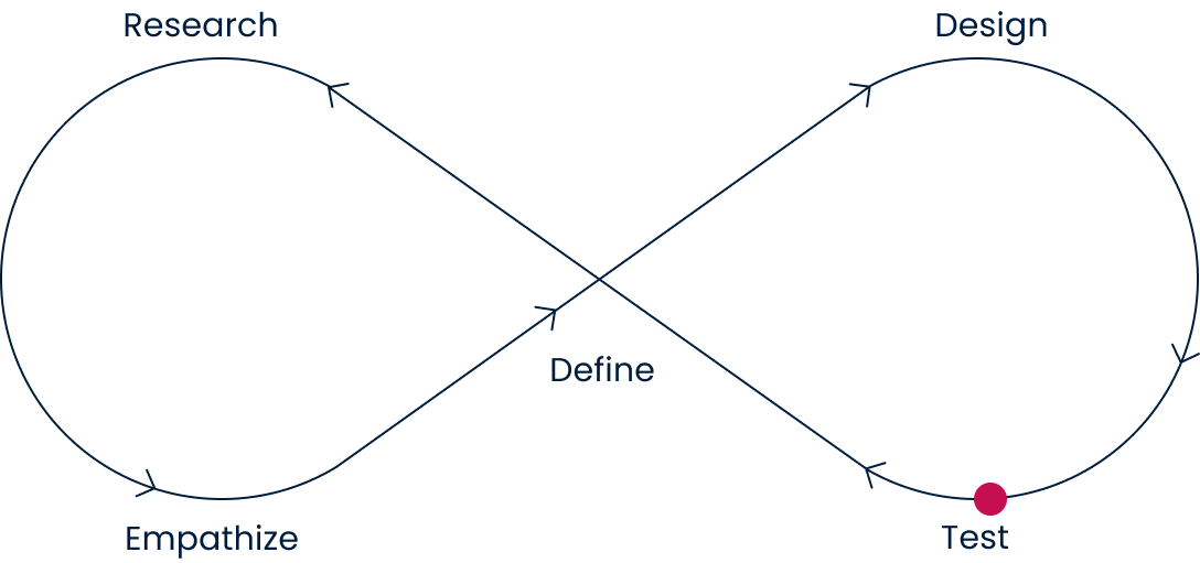
Navigating the Research Waters

I set sail into the sea of competitor websites, surveying the B2B and B2C landscapes. What stood out was the content overload that masked the essence of their offerings. I had a moment of realization – we needed to infuse more 'WHYs' into our own website. By doing so, we could better address user needs and ensure a harmonious blend of information for a more engaging and comprehensible experience.

Market and competitor analysis

Conversations with users revealed their struggles while navigating product-heavy websites. Clarity on benefits was obscured, causing overwhelm. This insight was invaluable.

In light of these findings, several indispensable features emerged:

  • a straightforward and easily accessible list of products to facilitate seamless exploration
  • the ability for users to practically engage with and comprehend the product's functionality
  • highlighting how the product stands out from its market counterparts, emphasizing its unique value proposition

By incorporating these essential elements into our design, we can significantly enhance the user experience, addressing their pain points, and ensuring that our website captures their attention by conveying the 'why' behind our offerings.

Charting the empathy course

The next waypoint was personas – Stefan, the B2B entrepreneur navigating digital winds, and three B2C personas, each with unique characteristics. They became my compasses, guiding me towards user-centricity.

Personas

Defining the structure

Like a skilled navigator plotting a course, the information architecture helped me expertly arrange the elements. Striking the perfect balance was paramount for me – presenting captivating content while ensuring visitors felt comfortably guided, not overwhelmed.

Information Architecture

Designing the destination

When I made the wireframes, I made sure to organize things neatly, like putting the most important stuff first. This made it easy to understand even the complicated energy ideas. You could scroll through everything smoothly. Plus, I made sure everything looked consistent and nice in all sections. I navigated the challenge of delivering lucid content for both energy experts and novices.

Wireframes

I decided to test the wireframes with potential users to see how they felt about the way things were organised, the order of things, and if everything looked the same across the different parts of the design. I gathered insights to refine the design:

  • a "contact us" CTA was missing at the top of the home page
  • a subpage "For you and me" was not clear for the potential end user
  • take an action for individuals is missing

Affinity map
Bringing the vision to life.....

Upon validating the wireframes, I transitioned to refining the brand style. While acknowledging our intention to delve deeper into the branding aspect down the line, our immediate goal was to unveil the new website by the end of 2021. To capture the essence of our brand, I aimed to evoke modernity, simplicity, joy, and elegance – qualities crucial for resonating with our conservative market in transition. Acknowledging the necessity of gradual progress, I strategically introduced fresh green and deep navy blue, and to distinguish ourselves from competitors, I introduced a touch of pink for a distinctive and invigorating look.

UI design

..... and developing in Webflow

With time pressing, we set sail directly to Webflow. As a result, usability testing was conducted directly on the platform, involving seven potential users. All participants accomplished the tasks successfully. This process yielded a valuable compilation of minor UI enhancements that significantly enriched the website's quality. Witnessing their enthusiasm and appreciation was incredibly gratifying, serving as a resounding affirmation that my efforts were indeed on the right track. As the year 2021 drew to a close, we proudly launched the website, marking a significant milestone.

Expanding horizons

As Exnaton's product portfolio expanded, so did the website. I replaced images with custom-designed illustrations, that help us sticking out companies offering technology for energy sector. Restructuring the information architecture accommodated five offerings, each with its distinct space.

Through this process, we realized that our website should focus on B2B interactions since our products target utility companies directly. Additionally, as our presence in the market grew stronger, I aimed to highlight our partnerships with businesses and the media to enhance our credibility.

Information Architecture

I replaced images with custom-designed illustrations that help us stick out companies offering technology for the energy sector.

UI visuals

A journey of continual growth

In Q1 of 2023, a comprehensive update aligned the website with the revised brand style guide prepared by design agency Atelier Disko. It was a reflection of our journey's progress.

The ceaseless cycle of learning and improvement also manifested as a new "newsroom" subpage. Our website mirrored our growth.

Lesson learned

The website's journey paralleled Exnaton's evolution – from investor focus to a B2B2C platform, culminating in a mature B2B product showcase. At each step, the design adeptly captured our transformation, embodying core B2B principles, refreshed branding, and heightened clarity. The resounding lesson: web design is an ongoing journey of refinement, mirroring Exnaton's unwavering dedication to learning and growth. This project shines as a symbol of perpetual improvement, mirroring our path. As our journey unfolds, so does our website, evolving in harmony with our business progress.

Through this journey as a UX Designer, I acquired a wealth of insights and lessons that have significantly enriched my professional skill set. Here are the key takeaways I have gleaned from this valuable experience:

  • The process of enhancing the website never really stopped. Even as my tasks shifted more towards product design, I still kept implementing changes for the website. A prime example was as the calendar turned to Q2 of 2023, the website stood as a living testament to our journey. A new addition emerged – the "newsroom" subpage. Here, we showcased Exnaton's media presence and participation in various events, offering an all-inclusive media kit for those seeking more.
  • I closely followed trends with greater attention, continuously improving our visual presence.
  • I've bolstered my skills in presenting new ideas and improvements to our stakeholders.
  • I've also forged even better collaboration with my teammates, especially those from sales and marketing, because through working together, this website could grow and become increasingly attractive to our clients.

Have a project you want to work together?

Get in touch